TLDR
- I will start looking for new opportunities from 2026, thus I updated my CV, and decided to completely recreate it with HTML and CSS, instead of using an MS Word or Google Doc document.
- I used pure HTML and CSS without any static site generator, templating engine, or CSS framework.
- The main tool for creating the layout was the Grid, which worked nicely for this purpose, and made it straightforward to make the design mobile-friendly too.
- The sizes were all specified with the
remunit, this resulted in a simple to understand setup, and made it easy to scale all the content with one single property for the purpose of the PDF generation. - For creating the PDF version, I use the built-in “Save as PDF” option of the browser’s printing function, which was a convenient way to convert the resume to a PDF.
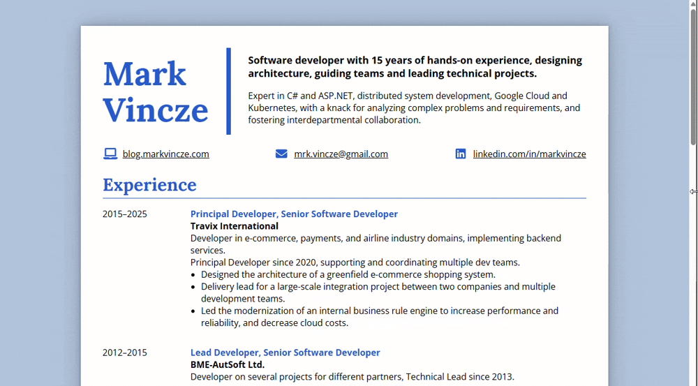
You can see the final resume here, and its source code on GitHub.
The rest of this post explains in more detail the approach for creating the CV, and the reasoning for the decisions I outlined above.
Motivation
After working for the same employer for 10 years, and not regularly updating my resume, I will be looking for a new job starting with 2026, thus I started looking into updating my CV.
My previous resume was created with Microsoft Word, and saved as a PDF to be able to share it with recruiters or add as an attachment when applying to positions. But since I’m not using the MS Office suite any more, I could not even properly open the original editable version, which I found somewhere on my hard drive saved as a docx file.
I considered using the same approach now as well, just switch from Microsoft Word to Google Doc. But the thought of this did not fill me with joy, I remembered that crafting a document with a fine-tuned layout in Word was a cumbersome experience, and I’d rather use an approach with which I could utilize—or potentially showcase—my skills relevant to my profession.
Thus I decided to create my new CV with HTML and CSS instead.
Goals
When I set out to create my new resume with HTML, I had the following goals:
- Create a layout which works well on both desktop and mobile screens, using responsive design.
- Publish the resume together with my website containing my blog.
- Even though I find a CV available as a web page more convenient than a PDF file, I know that the reality is that a PDF version of the resume is still a must-have to be able to upload as an attachment when applying to position, or sending to recruiters in emails. Due to this it was important to make it possible to easily export it as a PDF as well.
Using HTML also brings the following benefits:
- I can maintain it in source control, together with the contents of my website.
- Using the link to the resume will always open its latest version, which helps avoiding outdated version of the PDFs circulating.
- Potentially being able to use analytics to see how often my CV is opened.
Technology stack
My website and blog is created using the static site generator called Hugo, which I’ve used in the past for other projects, and it’s been working really well. And I wanted to host my resume together with my website and blog. Hugo—similarly to other site generators—is mainly used by maintaining the pages of the website using Markdown files, based on which it generates the HTML content of the site.
This approach was not the best for the purpose of creating a resume, given that I wanted to create a specific layout with multiple columns, fine-tune the margins and other styling properties to achieve a polished look, and adjust the HTML and the CSS to make it possible to effectively convert it to a PDF. This level of customization is more intricate than what the Markdown pages are typically used for, which are more intended for blog posts and other simple content pages.
Thus I decided to create my CV using raw HTML and CSS, to be able to fully control its layout and style.
The next question was whether to use any JavaScript framework, like a template engine to generate the HTML content, as it is shown for example in this post by Michael Engen, who used Eleventy with the Liquid templating engine, or David Reed using Zola with Tera.
This could bring the benefit of maintaining the content and the layout separately, thus eliminating some duplication, and potentially more easily swapping out the template part to achieve a new visual presentation without having to change the content.
Ultimately I decided against this, because I wanted to hand-craft the layout to a degree that it felt like I would not be able achieve much normalization by separating the content from the layout anyway, thus using a JavaScript templating library would have introduced some extra complexity without providing much benefit.
Due to these considerations, the technical stack of my resume ended up being a static HTML and CSS file, without using any JavaScript. This also made the necessary tooling really simple, I used VSCode to edit the markup and the styles, with the Live Server extension for hot reloading, to get the page in the browser to refresh on every change.
Styling
For the styling of my website, I use the Bulma CSS framework, which helps by providing a lot of useful styles for the basic page layout, headings, menu items, etc. But for my CV, to have full control over the layout and styling, and be able to tune it for PDF generation as well, I decided not to use Bulma, but rather create the CSS from the ground up, which allows precise control and keeping the amount of style code minimal.
Layout
Hand-crafting my CV was also a nice opportunity to catch up with the some improvements in CSS for creating layouts. Spending most of my time in recent years with backend development, I did not have to write much CSS, and the last technique for creating multi-column layouts I worked with was the well-known approach of using floats, which is widely viewed as a difficult and convoluted tool to use.
Since then, two new additions were introduced to CSS, namely the Flexbox and Grid layouts, which meant a major improvement in the way layouts can be created, making the markup shorter, simpler and more expressive, and eliminating the need to utilize all sorts of hacks to make float-based layouts render correctly on every browser. I was aware of these new capabilities, but haven’t directly used them before. (On my website, and for the UI of sabledocs I used the CSS classes provided by the Bulma framework.)
Thus creating the styles for my resume from the ground up seemed like a good opportunity to get familiar with these techniques. There are several blog posts and Stack Overflow questions discussing the merits of Flexbox and Grid layouts, but there is no exact authoritative answer regarding which one should be used in certain situations. That being said, the consensus seems to be that Flexbox is mostly intended for situations when we have one single row or column—such as a menu bar—(although it is capable of breaking content into multiple lines), and the Grid is a better choice if the content is expected to span into multiple rows or columns which need to be precisely aligned into a grid.
The layout I planned for my CV was certainly not very intricate, but it included aligning parts of the content in rows and columns, where it was important that those line up exactly to achieve a neat and tidy look.
Due to this, I decided to go with the Grid layout, which worked out nicely, it was straightforward to achieve the desired outcome, with simple, expressive syntax. And adjusting the styling for mobile screens, for example switching from a two-column setup to a single column, or decreasing the gap between columns was also easy to do.
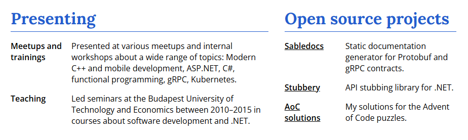
<section class="two-sections">
  <div>
    <h1>Presenting</h1>
    ...
  </div>
  <div>
    <h1>Open source projects</h1>
    ...
  </div>
</section>
.two-sections {
  display: grid;
  grid-template-columns: 3fr 2fr;
  column-gap: 2rem;
}
A note on sizing
If the decision between Flexbox and Grids can be confusing at times, then figuring out which size unit to use in CSS is even more challenging. CSS supports several different units for length, including absolute types like pt, px, cm, and relative units like em, rem, vh. (It turns out there are several more, that I haven’t even heard of before.)
For this purpose I opted to use the rem unit for all the sizes. Dimensions specified with the rem unit are interpreted relative to the root size of the page, which is the size of the html element, which—in most browsers—is 16px by default, and can be overwritten by users in their browser settings (which means it’s a good idea not to manually specify the font-size of the html element, because that way we’d be ignoring this potential user configuration).
Using rem for everything seemed like the sensible choice, for multiple reasons.
- This results in a simple setup, as all the sizes are relative to the root
font-size, it’s easy to understand. - The size of the content follows the font size configured in the user’s browser, thus it’s preferable from an accessibility standpoint.
- It is easy to scale the size of all of the elements by adjusting the
font-sizeof thehtmlelement. Which is not something that should be done for normal rendering in the browser, but it comes in handy for tuning the size of the content for the PDF generation.
Mobile screen support
I found it important that resume looks decent on smaller screens as well. The layout not being overly complicated, achieving this was relatively straightforward, I utilized a handful of media queries to adjust some of the styles depending on the screen size, mainly to switch from a multi-column layout to a single column, and to adjust the font and margin sizes.
/* Hide the background with the drop shadow, and adjust the padding. */
@media screen and (max-width: 65rem) {
  body {
    background-color: white;
  }

  #cv {
    padding: 2rem;
    margin: 0 auto;
    box-shadow: none;
  }
}
The Grid layout proved to work really nicely in this regard as well, adjusting the grid layout based on the screen size was straightforward to do just with CSS, without having to maintain multiple HTML variants.
PDF generation
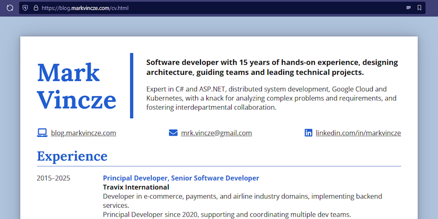
Even though I find the HTML version superior, mostly due to being responsive to screen size changes, not being split into pages, and just in general feeling more native, I know that it would be hard to avoid having a PDF version of my resume as well, to be able to include it as an attachment when applying to jobs.
I found multiple different ways to convert a HTML page to a PDF, the most popular seems to be the wkhtmltopdf CLI (although its repository is archived, without any mention in the README). I did a couple of attempts with this tool, but I couldn’t get it to work perfectly, for some reason it did not pick up all the styling from the CSS.
In the end I decided to go with the approach of using the Print functionality of the browser, with the “Save as PDF” printing option, which produced a much better result. This did not seem like much of a compromise, because the benefit of doing the conversion with a CLI would’ve been that I could’ve included it that in the CI build. But I found that any time I changed the content of the CV, I had to manually tinker with the printed font size to make sure that the layout fits neatly into the PDF pages as well, thus running the PDF generation as part of the CI build would not have been too useful anyway.
PDF styling
Depending on the style of your resume, you’ll probably need to do some adjustments to make sure that the layout of the PDF version neatly fits the A4 sized page(s) of the PDF document. And further changes might also be needed, for example my CV includes a background color and a drop shadow around the main content, which needs to be hidden in the PDF version.
Luckily there is support in browsers for customizing the styling of the printed version of a website, and because we use the built-in printing function of the browser to generate the PDF, we can utilize this for our purposes. The printed styling can be customized by using the @media print query.
/* Override the styling for printing to be able to save as PDF */
@media print {
  /* Remove the background and the drop shadow. */
  #cv {
    box-sizing: border-box;
    padding: 0 1.2cm 0 1.2cm;
    margin: 0;
    box-shadow: none;
    max-width: none;
  }
The other important thing is that probably your resume will not be perfect in the generated PDF on the first try. If you are not really lucky, the last page of the PDF will probably not be fully filled with content, and having a bunch of empty space at the end of the last page does not look polished. Also, page breaks might happen to be in places which might make an unaesthetic final result.
Page breaks can be forced to be placed at a certain point of the site by using the break-after: page style on the element after which we want the page break to be.
@media print {
  #education {
    break-after: page;
  }
And in order to make the content fill the last page properly, the size of the content can be scaled up or down. Because I consistently used rem for all of the sizes, all the content can be scaled by adjusting one single property, the font-size of the html element.
@media print {
  html {
    font-size: 8.5pt;
  }
I did not find a sophisticated way to automatically determine the font-size that will result in a nice-looking PDF, but rather I had to manually tinker with the value until a desired result is achieved. If we want to have the page breaks in a nice place, and ensure that the content fills up the pages evenly, then I don’t think this can be avoided, and it needs to be done every time the content of the page is changed.
My current CV fits into two pages, so after configuring the position of the page break, and finding a good font-size for the printed version, this is the result I get when printing the page as a PDF.
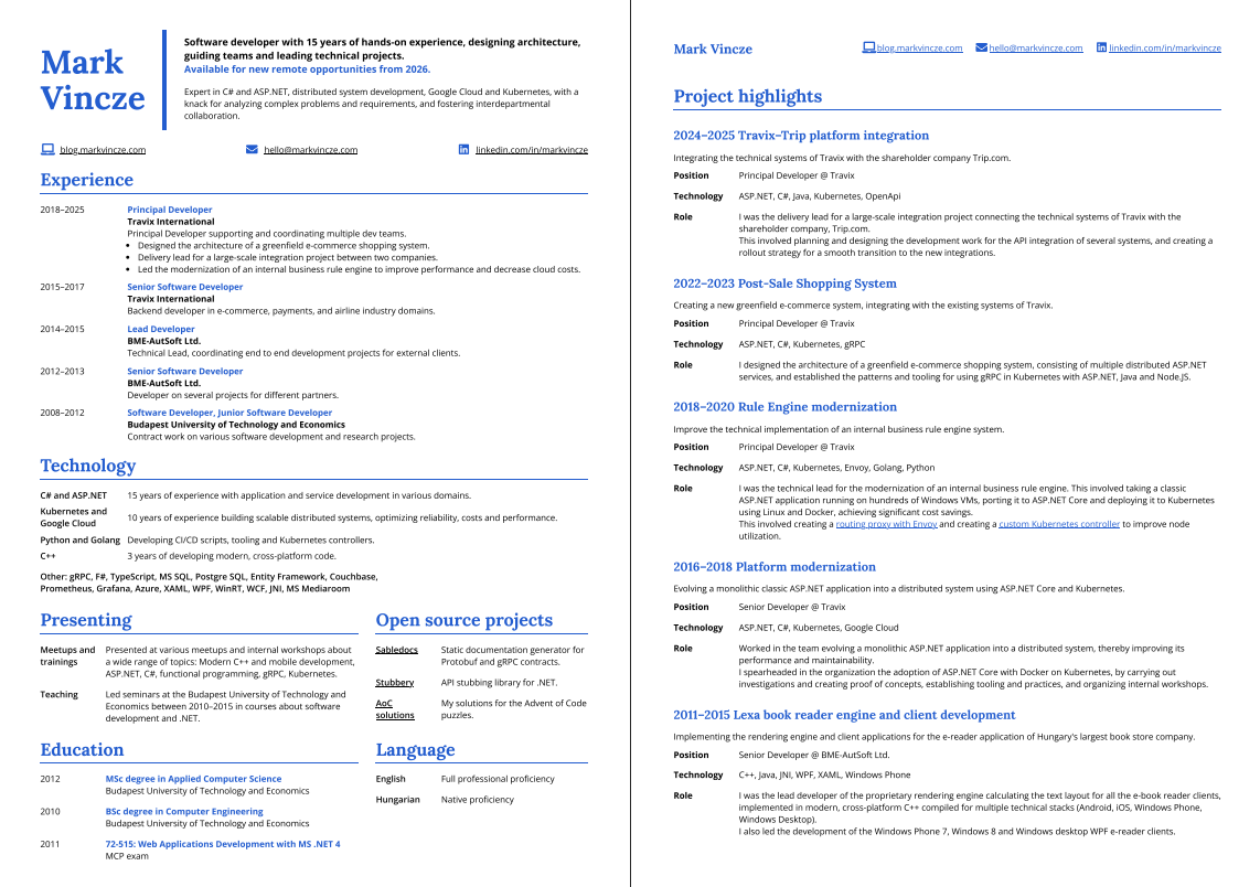
(I also included an extra heading with my contact info on the second page, which is not needed in the web-based version, so I hid it by default with display: none, and made it visible in the @media print {} section.)
Summary
You can see the final resume here, and its source code on GitHub. I’m happy with the final result, I find the design neat and simple, and being maintained with HTML and CSS makes me much more inclined to tinker with it and keep it up to date than if it was a docx file tucked away somewhere.
I hope this post will be useful for others as well to create resumes which are clean and modern, and maintaining them is a rewarding experience instead of an annoying hassle.